


Success! Your decision model returned a plan! Now it’s time to check out the results. What’s the best way to understand the solution and other model performance metrics? In some cases, that might be a density heatmap. In others, a box chart does the trick. The way a visualization summarizes and presents results for stakeholders can be the difference between your decision model making it to production or stalling out in research mode. This is where teams often rely on creating custom visualizations. From creating prototypes to building trust in the models and tracking them in production, these visualizations can impact the success of the model – and your organization’s operations.
Whether you’re visualizing routes on a map or tracking inventory fluctuations in a scatter plot, now you can visualize it all in Nextmv for smarter workflows and enhanced transparency. It's easier to interpret model output with the storytelling capabilities of custom visuals in context with the run details like input data, model version, and logs. Collaborate with operators, business users, and other stakeholders by sharing links to interactive visuals that surface the data they need to make informed planning decisions.
Nextmv supports popular visualization tools such as Plotly, Chart.js, and GeoJSON. Below are a handful of examples of the many different types of interactive charts, graphs, and other visualizations that you can attach to your decision model workflow on Nextmv:


Render your visualizations automatically
Optimization projects can lose momentum when it’s time-consuming to manage scripts and organize output data sets, run them, and distribute the resulting visualizations to varying teams. Integrating shareable, interactive visualizations as part of your automated workflows can save you time and accelerate decision model rollout.
Automatically create and attach your custom visualization to every model run. Instead of running scripts manually to report on results each time you run your model, include the visualization code with your model so it renders in the Nextmv UI as part of each run. Simply extend your model code by adding “assets” to the output. When you do, you'll generate an associated visualization with every run of your decision app on Nextmv.

Your custom visualization renders alongside all of your other run data such as input, results, and logs.

Here’s a quick demo of creating a custom app, adding code for a custom visualization, running the app, and rendering the visualization using the AMPL Price Optimization example from our community apps.
Use decision workflows to automate further
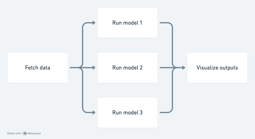
Visualizing the output of a single model run is great, but what if you’re looking to visualize data from multiple runs or even multiple models? For instance, you may want to visualize the number of utilized vehicles from three different routing models that represent three delivery regions.
With Nextmv, you can automatically render a custom visualization as part of a decision workflow. To do this, you can create an app in Nextmv that’s specifically for your visualization, allowing you to manage the code for your custom visual asset as a separate artifact alongside your optimization model. This app can run using the output from the model runs as an input to create the visualization.
Here’s an example workflow that fetches data, runs three different models, and then visualizes the output from them:
There are many different ways to use custom visualizations in your workflows. We’re thrilled to share this new capability with you – and we can’t wait to see how this accelerates your team to launch more models!
Get started with custom visuals in Nextmv
Ready to see your own visual assets in Nextmv? Create a Nextmv account and get started with one of our community apps that include built-in custom visualizations (Python Hello World and AMPL Price Optimization). Learn more in the docs. Have questions or feedback? We’d love to hear from you!


.png)


